Improved
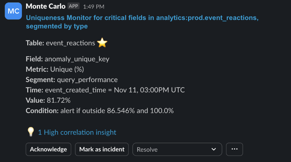
New layout for Metric Monitor notifications
over 1 year ago
We've released an updated layout for the notifications from Metric Monitor. In the last 6 months, we’ve dramatically expanded the functionality of this monitor. The layout for its notifications were not coping well with all the new functionality, so it was due for a refresh.
We’ve paid special attention to:
- Simplicity of language
- Consistent use of
codeformat - Consistency across different recipient types (e.g. not just optimizing for Slack)
- Both mobile and desktop experience

