Our new Create data product wizard provides a cleaner, more initiative process to help you create Data products in Monte Carlo. Start by going to "Create data product" under the Data product tab in the top menu.
-
Add a Name and Description that will make this Data Product easily identifiable by other users viewing this across your workspace.
-
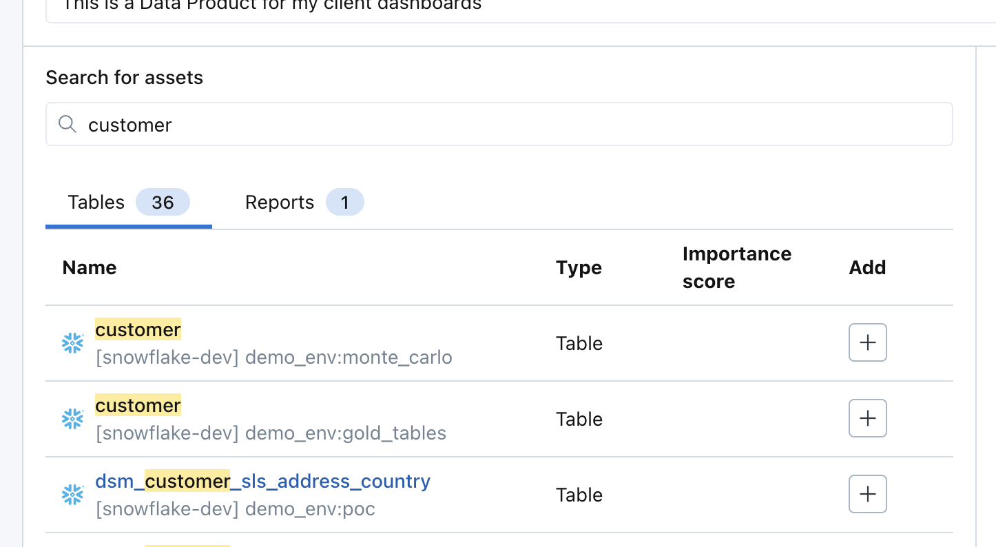
Search for assets that you would like to add to this Data Product. Table and Reports can be added. Click "+" under "Add" column to add them to the Data Product.
-
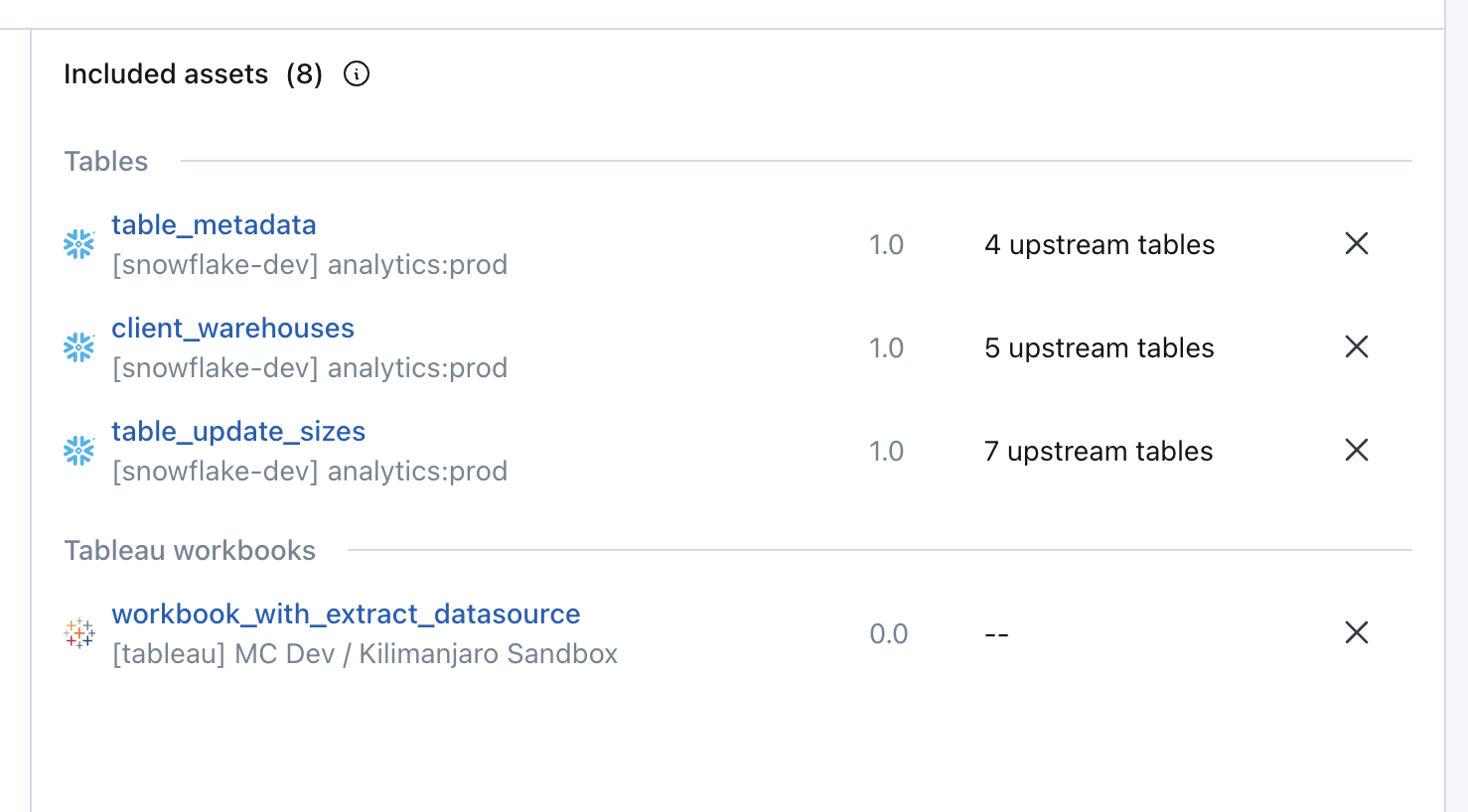
As you add Tables and Reports, you will see them appear on the right side.
-
The number behind "Included assets", e.g. "8" in screenshot below, represents the total number of unique tables necessary to build the data product. It includes all tables used directly by the product, as well as their upstream dependencies.
-
For tables and reports where upstream lineage is available, you will see a column for the number of upstream tables connected to that asset that will be included in the Data Product, e.g. "4 upstream tables".
-
-
Click "Next: Review"
-
In the Review step, you will be able to see all Tables and Reports to be included in your Data Product. The tables and reports you included in the previous step and all their upstream tables have been included in the Data Product. Refer to Why Include All Upstream Tables in Data Products.
-
Use the "Lineage" and "List" view to see the Data Product in different visual layouts

-
Use the Filters at the top to filter both of these views by the monitoring status of each of the tables included in the Data Product.
- Monitored - tables that are currently already monitored through other monitoring inclusion rules in the Usage UI
- Not monitored - tables that are not monitored or explicitly excluded from monitoring.
- Not supported - tables that exist in the lineage but monitoring through Monte Carlo is not supported
-
Click "Create and Monitor" to create the Data Product and monitor all "Not monitored" tables. Note: the
-
Once a Data Product is created, all tables in the Data Product will be automatically tagged with a Table tag.
See more details on Data products in our documentation: https://docs.getmontecarlo.com/docs/using-data-product-dashboards

