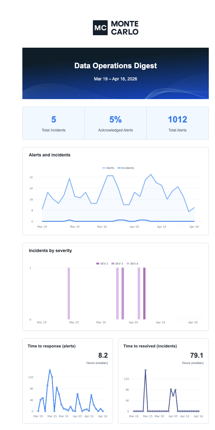
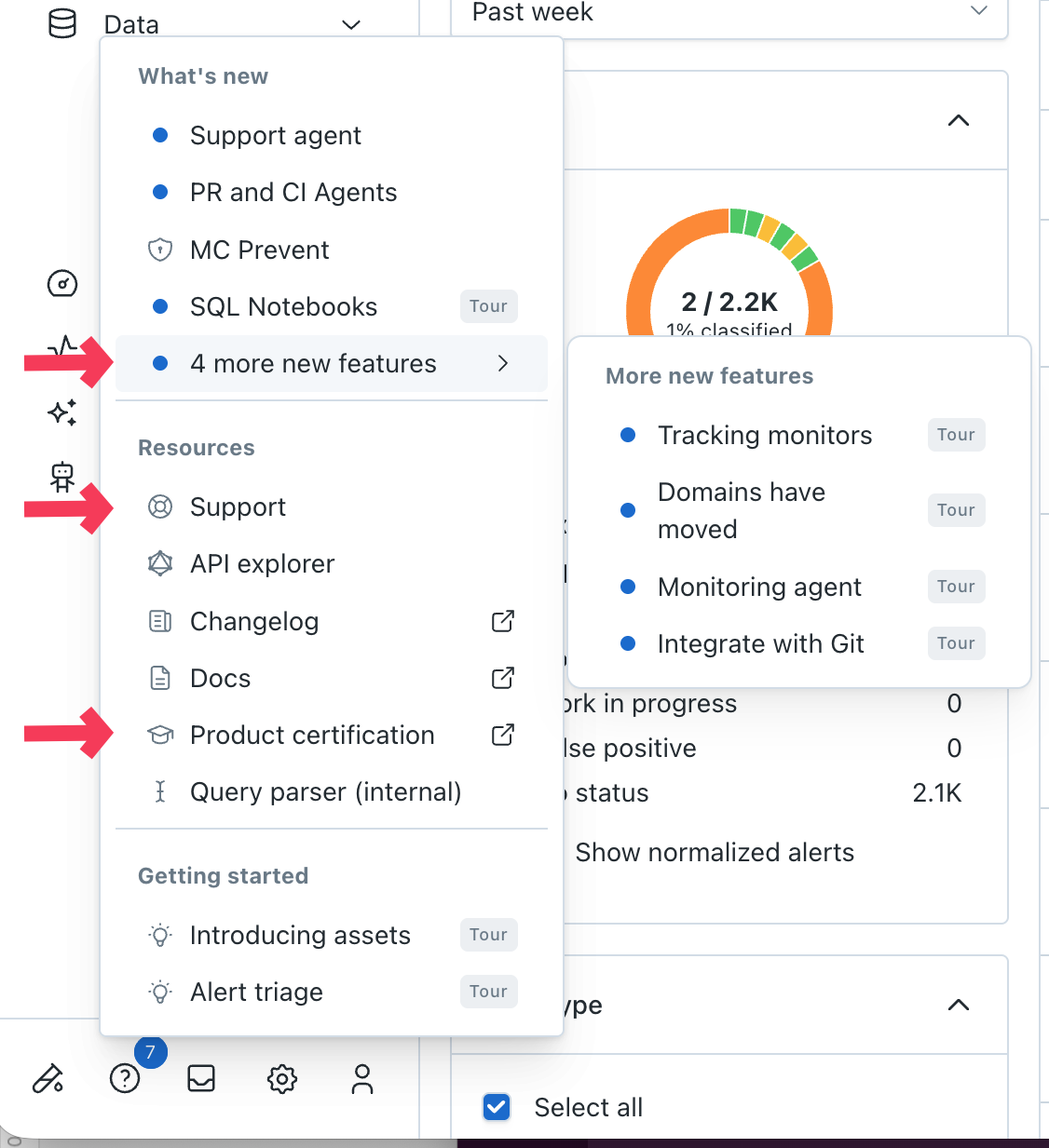
We are about to remove the two widgets at the top of the monitors page as the information they present appears in other dashboards in the product. This is the first step in our overhaul of the monitor list to improve usability and simplify monitor management workflows.

MC can now manage failures from Databricks Workflows. This helps users triage and resolves all data and system issues in one single platform. Follow docs here to set up the webhook connection to start alerting.

Azure Data Factory pipeline failures can now be managed via MC. This helps users centrally detect, triage and resolve Data Factory pipeline issues along with all other data incidents within MC. Follow docs here to start using.

On the Assets page, users interact with our out-of-the-box monitors for Freshness and Volume. It's also where they can configure an explicit threshold, if they prefer that instead of the machine learning.

If a user adjusts sensitivity or switches to an explicit threshold, those changes are now captured in a "Change log" that they can easily view. This makes it easy to see who adjusted the settings, when, and how. This has been a well adopted feature in custom monitors, so we are glad to extend it here as well.


What's new?

  • Alerts as your new landing page: Instead of the previous Home Page, you'll now land directly on the Alerts page after logging in. This gives you immediate visibility into the health of your data and allows you to take action on critical incidents right away.
  • Personalized experience: If you previously customized your home page to land on the Table Health Dashboard, no worries! You'll continue to land there. Similarly, users without access to Alerts will still be directed to the Assets page.
  • Streamlined navigation: We've reorganized the top navigation bar for improved clarity and ease of use. You'll now find the items in this order: Alerts, Monitors, Dashboards, Performance, Assets, Data Products, Settings.

Why this change?

We're committed to continuously improving your Monte Carlo experience. This update prioritizes efficiency and actionability, ensuring you can quickly address data issues and gain insights from your data observability platform.

As always, we welcome your feedback! Please don't hesitate to reach out to your customer success manager or support team with any questions or comments.

We’re thrilled to share that Data Profiler (formerly Data Explorer) is now generally available for Snowflake, Databricks, BigQuery, and Redshift. With Monte Carlo’s data profiling and monitor recommendation capabilities, data practitioners can quickly and effectively set up data quality monitoring:

  • Find patterns in table data using customizable filters.
  • Discover field-specific insights like time ranges, string lengths, common values, and more.
  • Improve data quality by activating preconfigured monitors that are generated by analyzing data samples and table metadata.


We've expanded the functionality and simplified the experience of managing monitors as code:

  • Added a button to generate monitor YAML configuration from each monitor's UI creation flow
  • Added support for Data Quality Dimensions
  • Added support for Query Performance Monitors
  • Added default values for alert_conditions and schedule fields
  • Renamed fields to be consistent with the UI (backwards compatible to prevent breaking existing configuration)
    • resource is now warehouse
    • comparisons is now alert_conditions
    • notify_rule_run_failure is now notify_run_failure
  • Updated our documentation: https://docs.getmontecarlo.com/docs/monitors-as-code

We've released an updated layout for the notifications from Metric Monitor. In the last 6 months, we’ve dramatically expanded the functionality of this monitor. The layout for its notifications were not coping well with all the new functionality, so it was due for a refresh.

We’ve paid special attention to:

  • Simplicity of language
  • Consistent use of code format
  • Consistency across different recipient types (e.g. not just optimizing for Slack)
  • Both mobile and desktop experience

Monte Carlo now supports categorizing and reporting directly on data quality dimensions!

  • Data quality dimensions in monitor creation: Assign data quality dimensions directly when creating or editing monitors. Monitors as code and API are of course supported as well.
  • Dimension scores on data quality dashboard: View data quality scores by dimension (Accuracy, Completeness, Consistency, Timeliness, Validity, Uniqueness).
  • Alert categorization: Identify and organize alerting monitors by data quality dimension.
  • Bulk Actions: Apply tags or assign data quality dimensions to multiple monitors simultaneously for streamlined organization.

These features offer more granular control and insight into data quality, improving data management efficiency! Learn more about data quality dimensions in the docs.