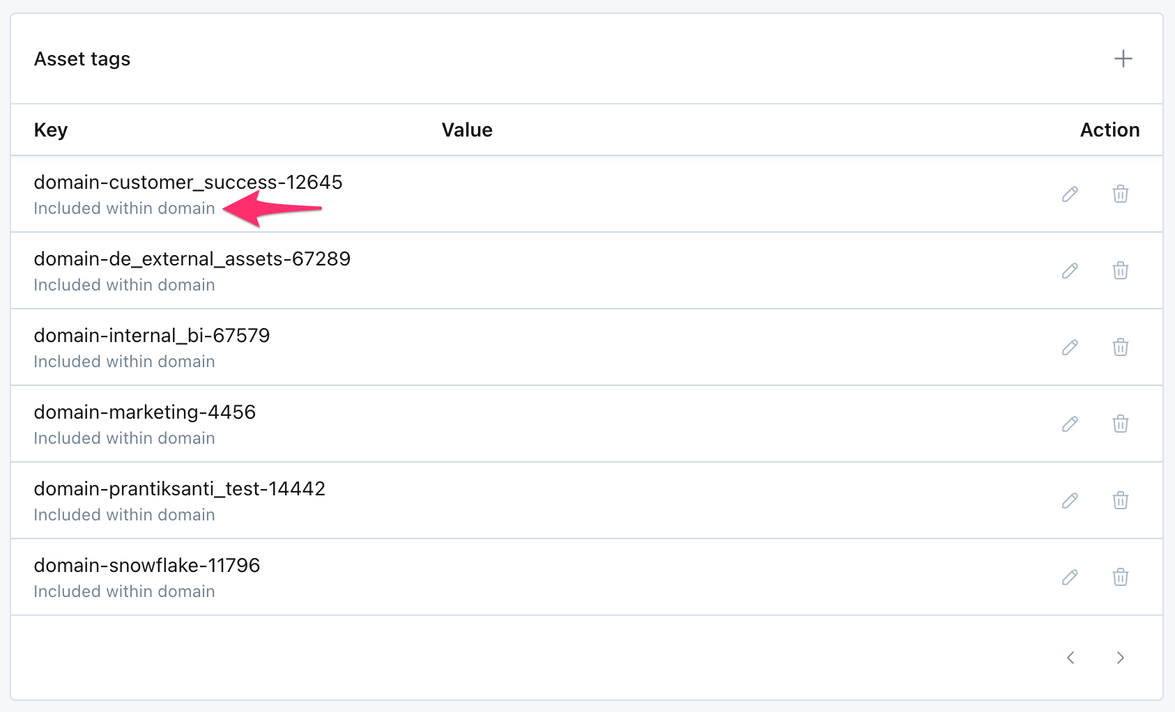
We've added a rule under the Usage UI to let you select what tables to monitor based on tags. Under a Schema in the Usage UI, you can select Monitor tables where "tag" is one of: and specify a multi-select list of tags. This accompanies the rest of the rules we support, for a full list, see our documentation.

We've added two new rules to help you select which tables to monitor. Under the Schema level in the Usage UI there are two new rule types that can be added as include/exclude conditions:

  1. Tables of a certain type (e.g. View, External, etc)
  2. Last Activity was within 30 days

Tables of a certain type

This rule type can be used to make sure a certain type of asset is included or excluded from monitoring. Supported types depend on your warehouse and integration with Monte Carlo.

Last Activity was within 30 days

This rule can be used to ensure that only recenly active tables are monitored by Monte Carlo. "Recent Activity" is defined as any Read or Write activity.

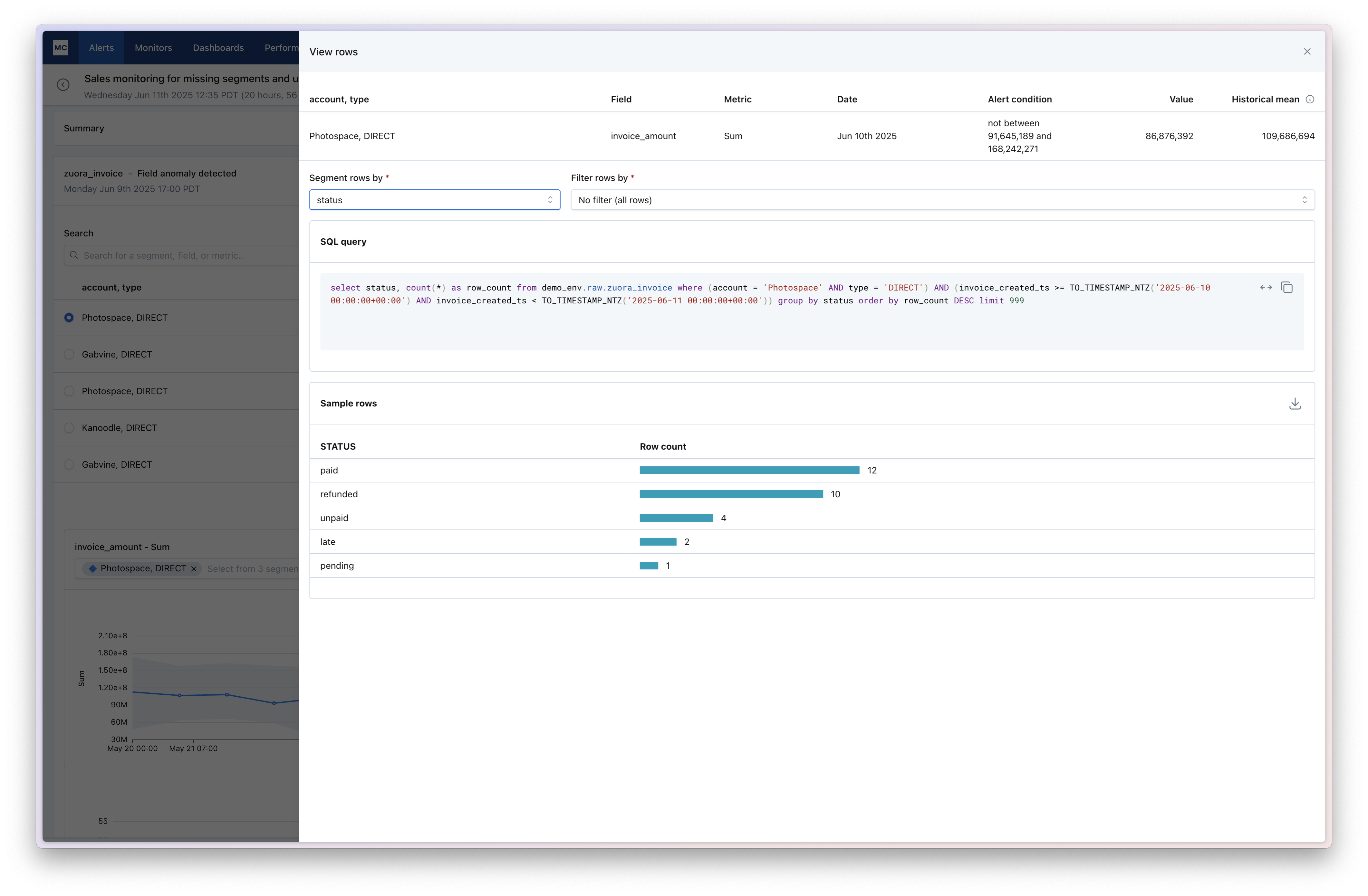
Users of Data Explorer can now drill-down into a field profile metric in Data Explorer to see how that metric has trended over time. This helps a data analyst to validate an issue reported by a business partner. For example, if someone in marketing ops is reporting they’re suddenly seeing a bunch of nulls in a key field, it’s now much easier to come in and validate that spike in nulls without ever writing SQL or setting up a monitor.

We've made key improvements to the automatic threshold option in SQL Rules, giving users more accuracy and more control in detecting anomalies. The automatic threshold now supports:

  • Low, medium, or high sensitivity. Users can adjust this through the UI or Monitors as Code, allowing for tighter or looser thresholds.
  • Removing historical true positives from the machine learning, preserving the sensitivity of the thresholds. Incidents marked as fixed or helpful will be taken into account when training our ML model.
  • Refactored model based on user feedback to improve accuracy.
When configuring a SQL Rule with an automatic threshold, users can now select between Low, Medium, or High sensitivity.

When configuring a SQL Rule with an automatic threshold, users can now select between Low, Medium, or High sensitivity.

For customers that have enabled the ServiceNow integration, the state of incidents from ServiceNow can now be sync'd back to incident status in Monte Carlo. This reduces toil of keeping multiple systems up to date.

Users can indicate the mapping of ServiceNow state → incident status in Settings > Integrations. See our ServiceNow docs for more details.

Users can now more easily allocate query cost from custom monitors back to the teams that set them up. This was a functionality previously available via API only, which can now more easily be done in UI.

Users can:

  • Create additional connections to a warehouse and associate them with different warehouse service users (one for each team).
  • Once more than one connection has been created for a warehouse, you can now select which connection to use in the monitor creation flow.
  • Queries from that monitor will then be executed through the different service users, allowing you to allocate cost back to to the corresponding team.

To learn more, check out our documentation.

Last month, we released 35+ new Field Metrics. At the time, only manual thresholds could be used on those new metrics. Today, we’ve released support for ML thresholds for many of those new metrics!

Specifically, we now support ML thresholds for the following:

  • Empty string (%)
  • NaN (%)
  • Standard Deviation
  • True (%)
  • False (%)
  • SSN (%)
  • USA Phone Number (%)
  • USA state code (%)
  • USA ZIP code (%)
  • Email (%)
  • Timestamp (%)
  • In past (%)
  • Unix time 0 (%)

In addition, you can now select the following as standalone metrics with ML thresholds (previously, they were all grouped together):

  • Min
  • 20th percentile
  • 40th percentile
  • 60th percentile
  • 80th percentile
  • Max

To see the full list of supported Field Metrics and available threshold types, see our Available Metrics documentation.

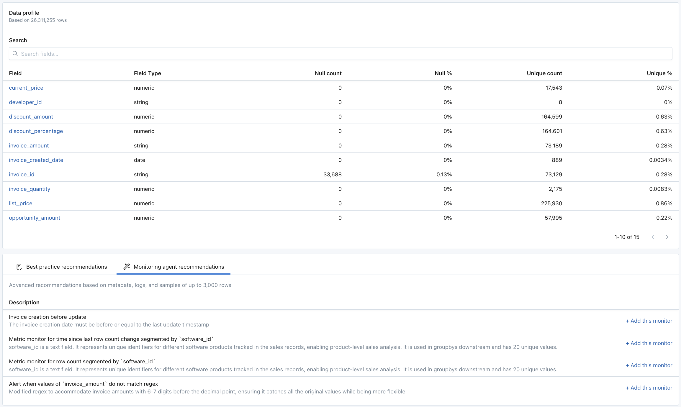
Data Explorer is a new tab on Assets that makes it easy to profile the contents of a table or view. This is helpful when investigating a data quality issue reported by a business partner, when considering which monitors to create, or when getting familiar with the contents of a table.

The experience is interactive and no-code, making it approachable for less technical roles. Users can point and click to adjust the time range of data and filter down for particular segments. In the future, we'd like to make it easy to compare multiple segments of data side-by-side.

Currently, Data Explorer is available for just a subset of customers and for the Snowflake integration only. Your Monte Carlo Agent must be version 16624 or higher. To learn more, check out our documentation.

**Filters**, **Row count**, and **Segments** sections of Data Explorer. Adjust the slider in Row count and click on values in Segments to filter the rest of the data in the dashboard.

Filters, Row count, and Segments sections of Data Explorer. Adjust the slider in Row count and click on values in Segments to filter the rest of the data in the dashboard.

**Field profile** and **Sample rows** sections of Data Explorer.

Field profile and Sample rows sections of Data Explorer.

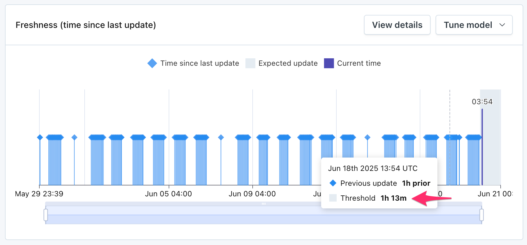
Users can now manage their freshness thresholds - whether automatic or manual - all from Assets > Freshness. To see this drawer, click View Details on the Freshness widget in Assets. User can then click Edit and choose between:

  • Automatic: ML will determine the threshold, and the user can choose between High/Med/Low sensitivity.
  • Explicit: User will determine the threshold
  • Disable: Freshness monitoring will be turned off for the table.

Freshness thresholds set through Assets > Freshness will follow the notification routing and grouping logic of out-of-the-box freshness monitors, regardless of whether “Automatic” or “Explicit” thresholds are selected.

These changes are geared to give users one place to manage the freshness thresholds for a table, instead of being fragmented across different experiences for out-of-the-box freshness and Freshness Rules.

We will continue investing in easy and scalable ways to deploy manual thresholds. But we don’t think that the old experience for Freshness Rules is the right path. As a result, we’re removing the ability to create the old-style Freshness Rules through the UI. Existing Freshness Rules will continue to function, and users can continue to create them through Monitors as Code. More details to come.

To learn more, see our documentation for Freshness monitoring.

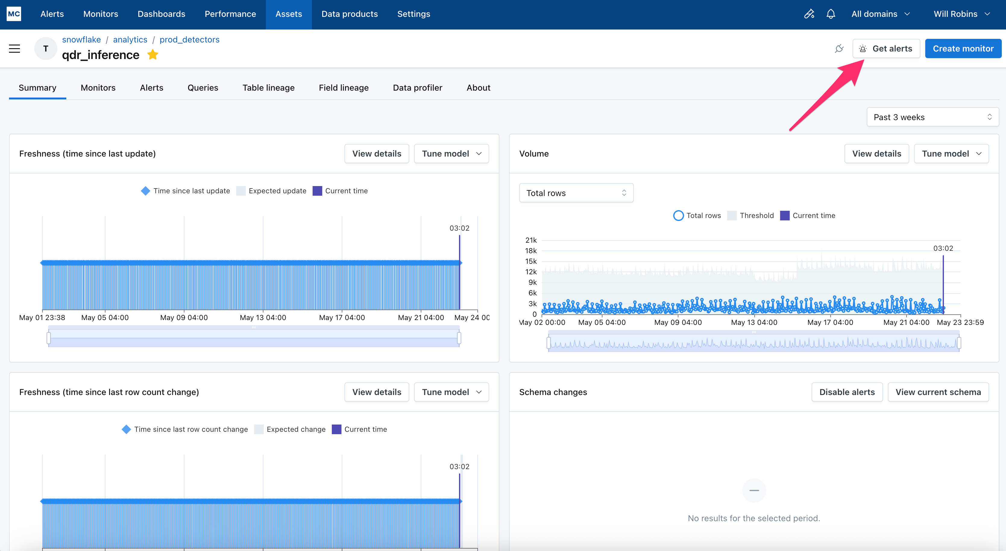
We’re refreshing charts across the app so they all have 1) a clearly defined metric, 2) a clear threshold, 3) a legend, 4) properly scaled and labeled axis, 5) clearly marked anomalies.

New volume charts show just that – clear metrics (toggle between row count, or change in row count), clear thresholds, an interactive legend, better axis scaling, and clear anomalies. This improves usability and interpretability, so that understanding an anomaly is simple.