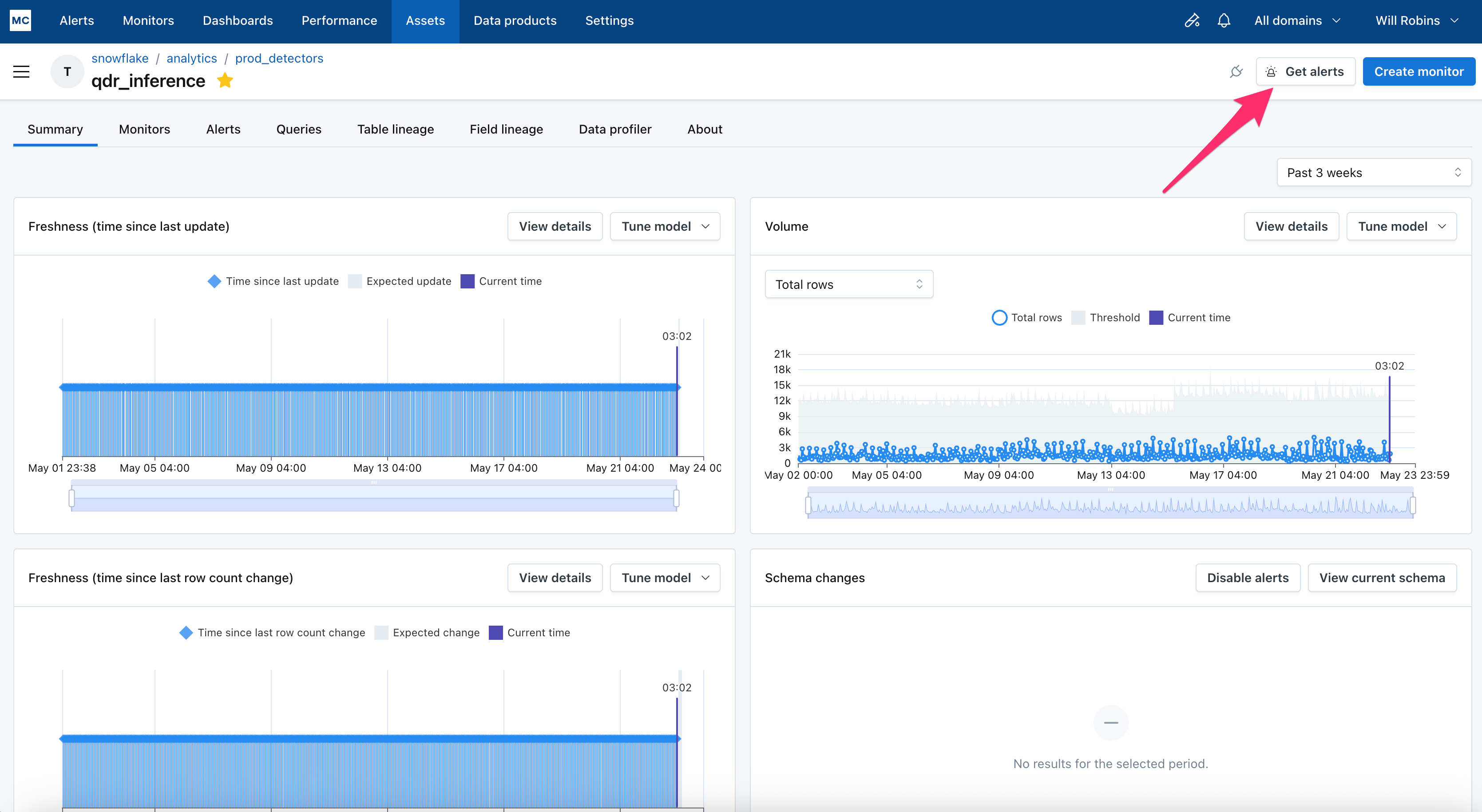
On the Assets page, users interact with our out-of-the-box monitors for Freshness and Volume. It's also where they can configure an explicit threshold, if they prefer that instead of the machine learning.
If a user adjusts sensitivity or switches to an explicit threshold, those changes are now captured in a "Change log" that they can easily view. This makes it easy to see who adjusted the settings, when, and how. This has been a well adopted feature in custom monitors, so we are glad to extend it here as well.
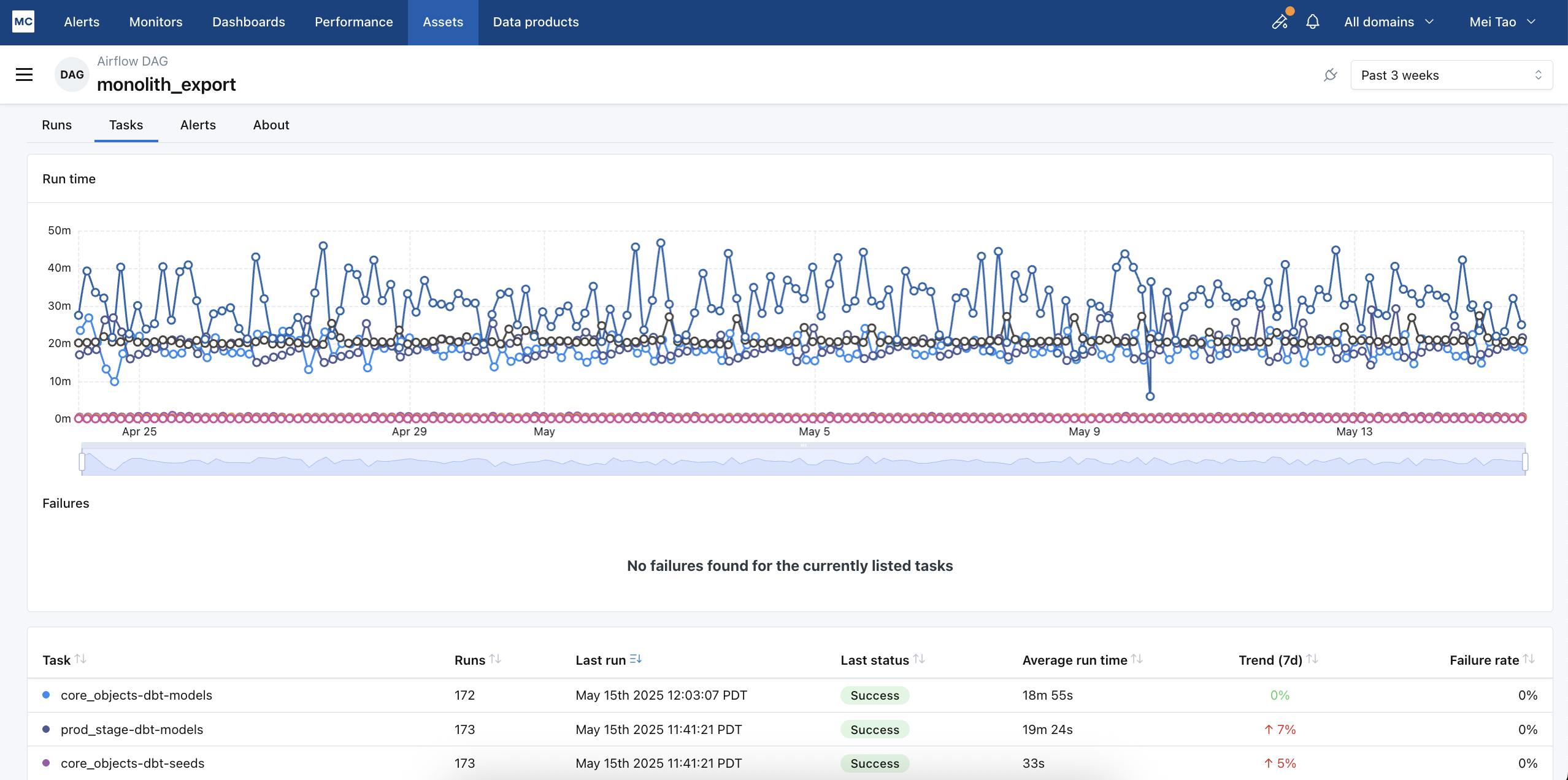
Alerts as your new landing page: Instead of the previous Home Page, you'll now land directly on the Alerts page after logging in. This gives you immediate visibility into the health of your data and allows you to take action on critical incidents right away.
Personalized experience: If you previously customized your home page to land on the Table Health Dashboard, no worries! You'll continue to land there. Similarly, users without access to Alerts will still be directed to the Assets page.
Streamlined navigation: We've reorganized the top navigation bar for improved clarity and ease of use. You'll now find the items in this order: Alerts, Monitors, Dashboards, Performance, Assets, Data Products, Settings.
Why this change?
We're committed to continuously improving your Monte Carlo experience. This update prioritizes efficiency and actionability, ensuring you can quickly address data issues and gain insights from your data observability platform.
As always, we welcome your feedback! Please don't hesitate to reach out to your customer success manager or support team with any questions or comments.
We’re thrilled to share that Data Profiler (formerly Data Explorer) is now generally available for Snowflake, Databricks, BigQuery, and Redshift. With Monte Carlo’s data profiling and monitor recommendation capabilities, data practitioners can quickly and effectively set up data quality monitoring:
Find patterns in table data using customizable filters.
Discover field-specific insights like time ranges, string lengths, common values, and more.
Improve data quality by activating preconfigured monitors that are generated by analyzing data samples and table metadata.
We've released an updated layout for the notifications from Metric Monitor. In the last 6 months, we’ve dramatically expanded the functionality of this monitor. The layout for its notifications were not coping well with all the new functionality, so it was due for a refresh.
We’ve paid special attention to:
Simplicity of language
Consistent use of code format
Consistency across different recipient types (e.g. not just optimizing for Slack)
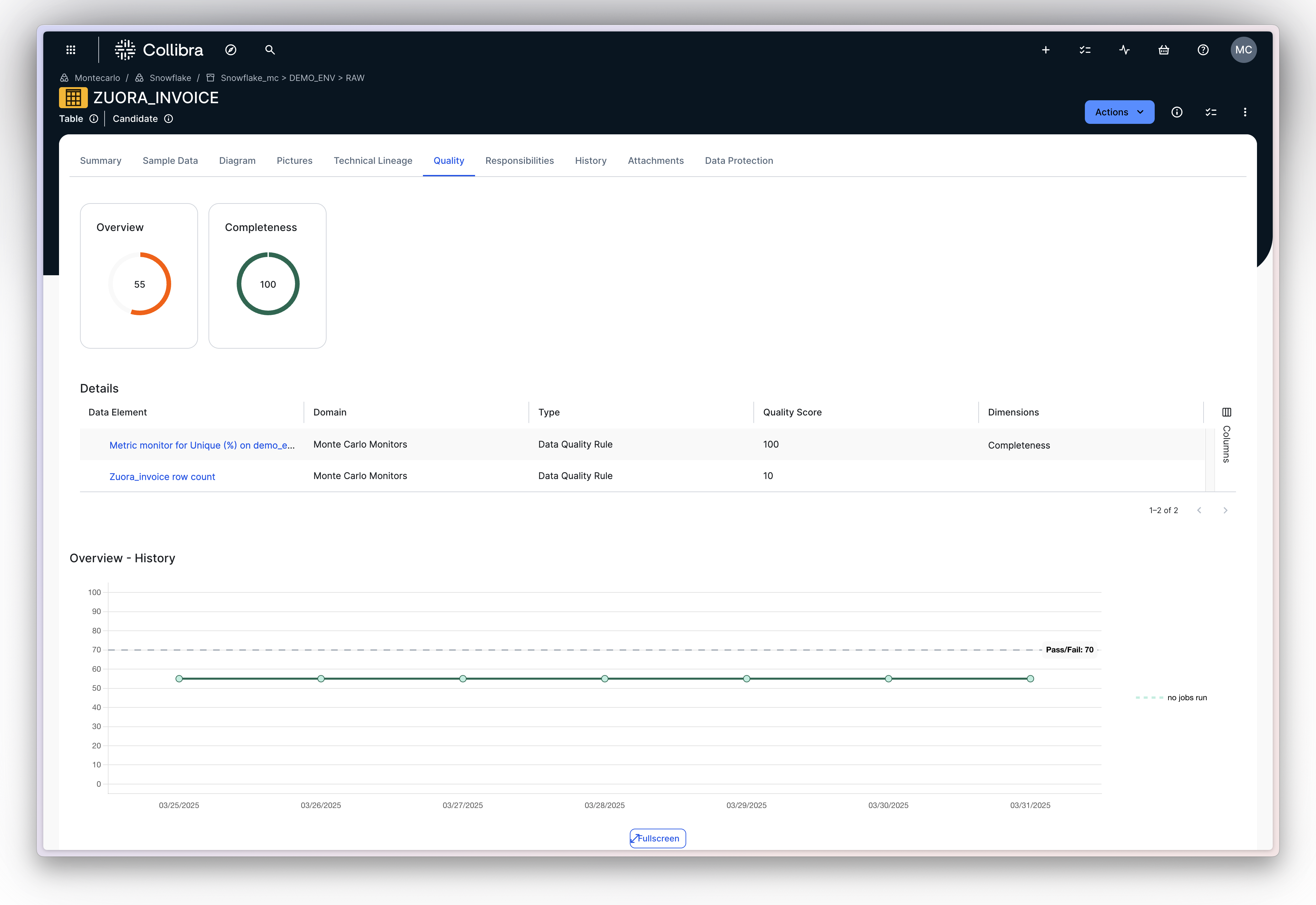
Monte Carlo now supports categorizing and reporting directly on data quality dimensions!
Data quality dimensions in monitor creation: Assign data quality dimensions directly when creating or editing monitors. Monitors as code and API are of course supported as well.
Dimension scores ondata quality dashboard: View data quality scores by dimension (Accuracy, Completeness, Consistency, Timeliness, Validity, Uniqueness).
Alert categorization: Identify and organize alerting monitors by data quality dimension.
Bulk Actions: Apply tags or assign data quality dimensions to multiple monitors simultaneously for streamlined organization.
These features offer more granular control and insight into data quality, improving data management efficiency! Learn more about data quality dimensions in the docs.
We've rebuilt the Metric Monitor to address many key points of customer feedback! Improvements includes:
“Seasonal” pattern detection, with special attention to day-over-day and week-over-week patterns.
Tighter thresholds that ‘hug’ the trend line
ML thresholds available on all metrics
Rapidly trained thresholds by backfilling up to 1 year of historical metrics (learn more). Thresholds often appear after the first run of the monitor + backfill is complete
Requirement for minimum row count per bucket is removed
Note – to support these changes, the backend and data model needed significant refactoring. So much so that this a hard “v2” of the Metric Monitor. Existing Metric Monitors will continue to function without interruption, but only newly created monitors will get these improvements.
We encourage users to try it out! There are some slight differences in the configuration of a v2 Metric Monitor, compared to before. For example:
Users are now asked how many days or hours of recent data should be ignored, since it might not be mature yet for anomaly detection.
To support ingest of much more historical data, segmented metric monitors are now limited to a single alert condition, which can contain only 1 metric and 1 field.
An example of the thresholds from a new metric monitor. Note that they 'hug' the trendline much better and incorporate week-over-week patterns in the data.
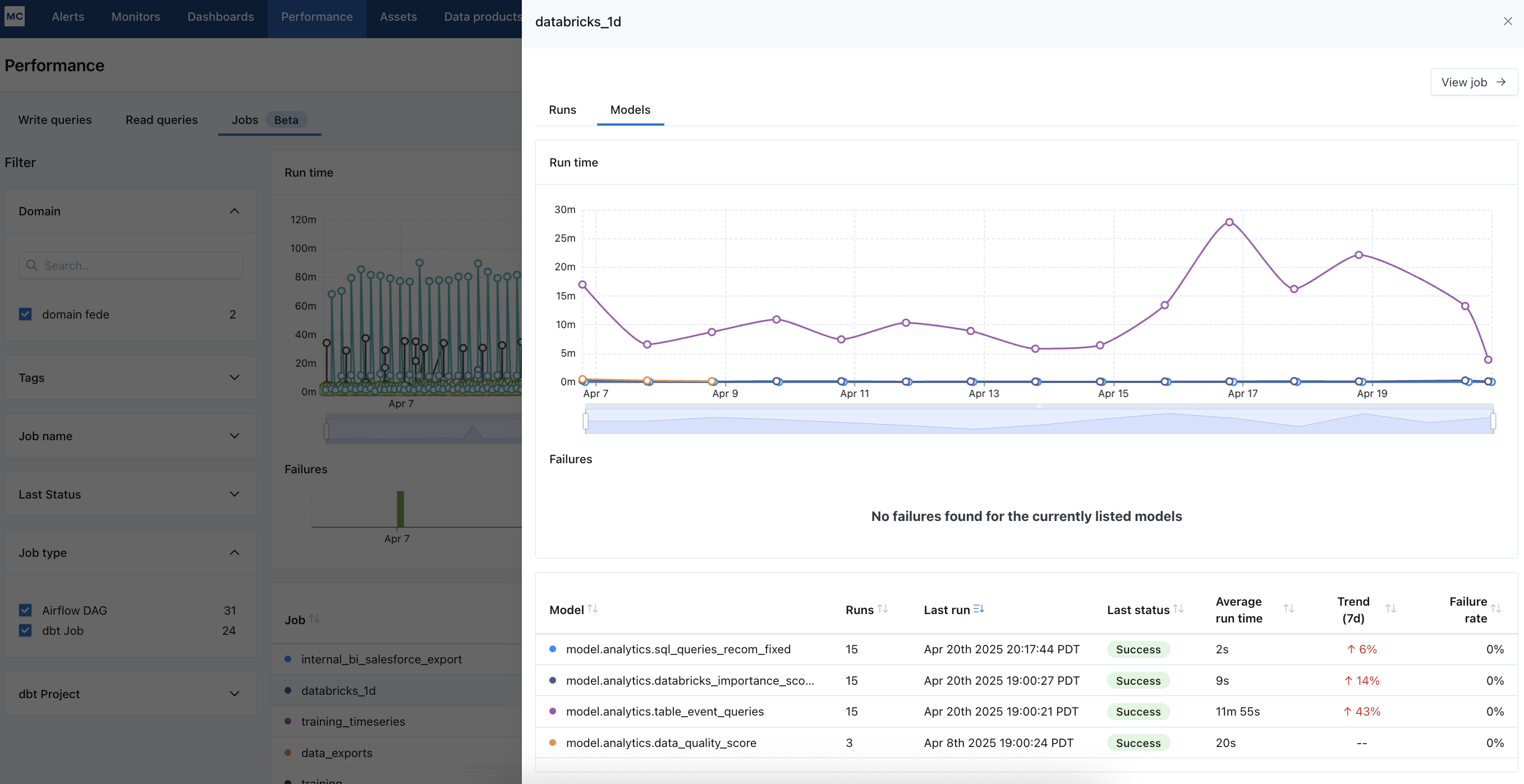
A Databricks Workflows integration is now available, which allows users to identify which Databricks job updated a given table, what are its recent run results, and how workflow runs impact the quality of a table. Very soon it will also alert on workflow failures.
Permissions to job system tables are required to enable the integration. More details here.
A beta version of Azure Data Factory integration is now available. The initial version generates cross-database lineage, lets users check which ADF pipeline updated which table, and shows run details for each pipeline, to accelerate data incident resolution. In a few weeks, we will also let users centrally manage ADF pipeline failures in MC.