You can now filter for 'No audience' on the /Monitors page. This will return the list of custom monitors that do not have any audience, making it easy to understand which monitors are not sending notifications to any recipients.
You can now filter for 'No audience' on the /Monitors page. This will return the list of custom monitors that do not have any audience, making it easy to understand which monitors are not sending notifications to any recipients.
Our machine learning models continually adapt and improve based on user feedback. We've recently adjusted our training process. Now, marking an incident as 'Fixed' will have an effect similar to providing 'Helpful' feedback. Both actions will be used to adjust thresholds, ensuring the anomaly does not impact or increase them.
Starting in v0.80.0 of the CLI (releasing on February 7th, 2024), the "AWS profile name" and "AWS region" options will be removed from the initial configuration process (i.e., montecarlo configure), as this was not a necessary parameter for most commands.
The profile and region will now need to be set when interacting with any AWS-related commands via the aws-profile and aws-region flags.
The cli docs and help commands will indicate when these flags are necessary.
Notifications as Code 2.0 now supports all recipient types. Previously, just Slack, Email, and PagerDuty were supported. Now, the list of available recipient type is at parity with the UI, supporting recipients like Microsoft Teams, Jira, ServiceNow, Webex, Webhooks, and more. To learn more, check out the docs.
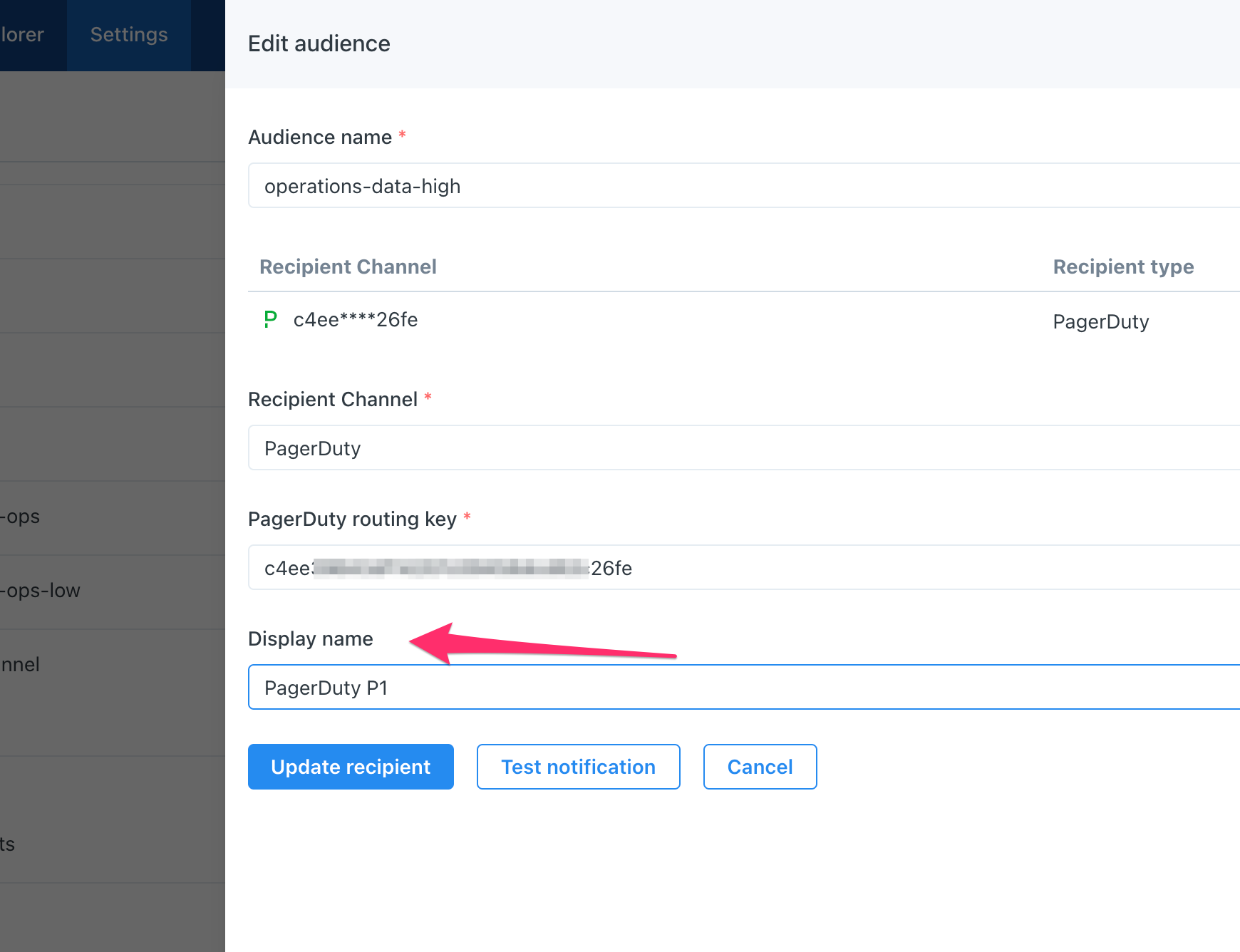
You can now give a display name to a recipient in an Audience. That display name will then show up anywhere the recipient is shown in MC, such as the Incident page and within custom monitors.
No more ugly URLs or alphanumeric keys that are meaningless to the average user!
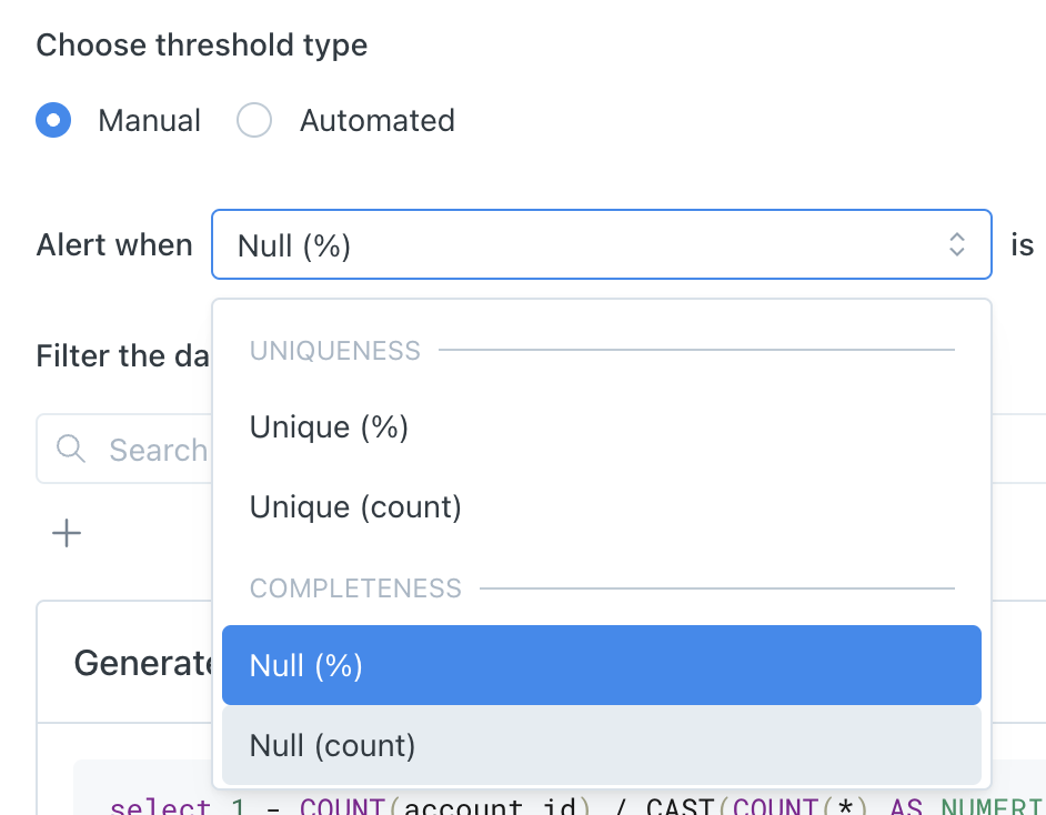
We've added 38 new metrics to Field Metrics Monitors. Check our docs page to see the full list of available metrics. Many of the newly released metrics are supporting manual thresholds only, and automated thresholds for them will be released soon.
In addition, we've introduced some categorization to help organize all the different field metrics:
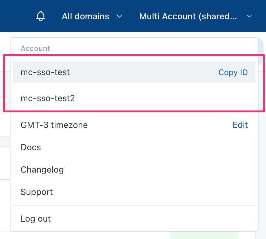
Some large enterprises have more than one Monte Carlo environment. A subset of their users and admins need to frequently traverse between their multiple accounts. This used to be a cumbersome process to log out and log back in, but has been made much easier.
All the accounts for which an email address is a user are now presented in the top-right dropdown, allowing the user to easily switch between accounts.
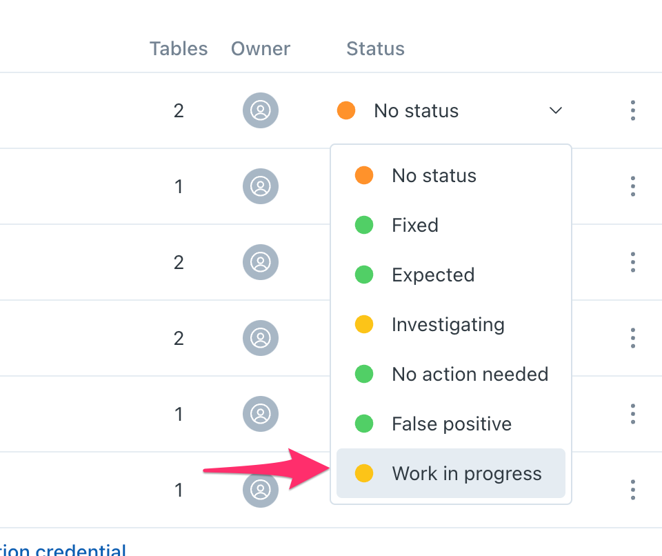
We’ve made a change to the list of Incident Statuses for the first time in a while! We've added Work in progress, which makes it easy to indicate that an Incident is a real issue and is being worked on.
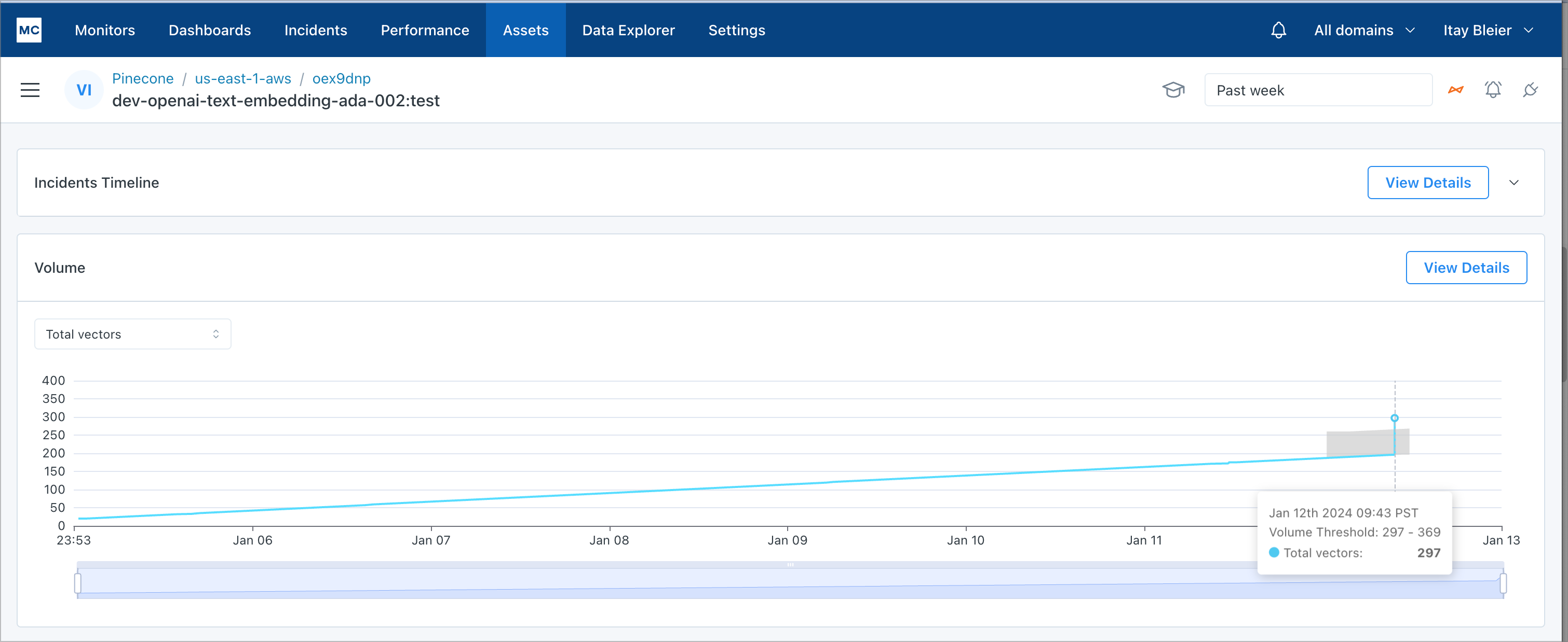
Connecting Pinecone to Monte Carlo allows for monitoring the most critical component of your AI pipelines. We've brought Monte Carlo's data anomaly detection to Pinecone by observing patterns in Vector Count by Index and Index Namespace.
As soon as you connect Pinecone, hourly tracking of Vector Count by each Index and Index Namespace will be cataloged to be view and actively monitored by Monte Carlo's machine learning - no other setup necessary. You can see the expected Thresholds of Vector Count highlighted on the chart as well.
Learn how to setup Pinecone with Monte Carlo in the documentation. More monitors and metadata about your Pinecone assets are coming soon.