The Incidents and Insights dashboard has been renamed Insight Reports, where all CSV reports are available for download.
Monte Carlo can now integrate with multiple Slack environments. Historically, you could only connect with a single Slack workspace, which was a challenge for large organizations had different slack workspaces per business unit. Now, you can connect multiple workspaces, allowing you to send the right notifications to the right people.
Once multiple Slack integrations are configured, the user can select which integration to use when adding recipients to an audience.
It is now possible to deploy Comparison Rules using Monitors as Code. When this new monitor type was initially released in November, configuration was only supported via the UI. With Monitors as Code, they can more easily be deployed at scale.
While PagerDuty has been a long-supported integration for years, it was not included as a recipient type in Notifications as Code. Until now!
PagerDuty is now supported as a recipient type in Notifications as Code 2.0.
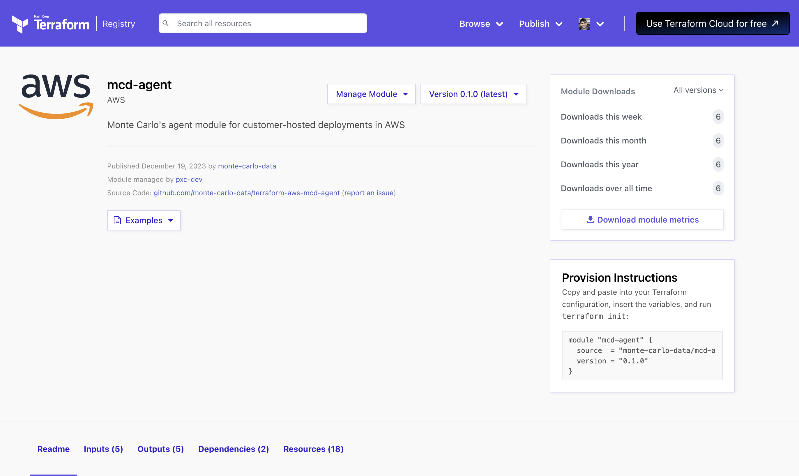
Monte Carlo now supports the new agent architecture on AWS with both CloudFormation and Terraform!
Key Benefits of the new architecture include:
- Simplicity: the agent has far fewer resources and components than before.
- Transparency: the code and templates are all publicly available for easy review with an audit and change log.
- Faster & Fewer updates: get improvements to Monte Carlo more quickly, but also with fewer manual upgrades.
- Flexibility: support the customizations you needed.
- More reliability: reachability heartbeats + faster deployments.
Learn more in our docs!
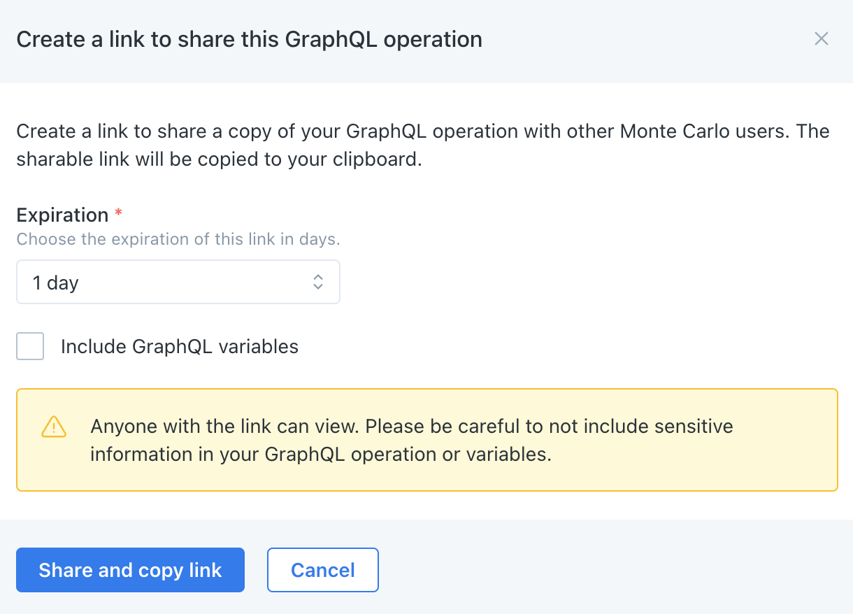
Operations (i.e. API queries and mutations) can now be directly shared and loaded from the API explorer!
Learn more in our docs.

Coming soon in November: we are announcing Monte Carlo's foray into data observability for SAP Hana, starting with the ability to run SQL Rules and detect Volume anomalies. SQL Rules can be created in either the UI and/or programmatically via Monitors-as-Code (API/SDK too). These monitors can be used to generate notifications to relevant stakeholders, circuit break pipelines, and conduct RCA (e.g. sampling). Asset entries are also created in Monte Carlo and Custom Lineage APIs are available to write lineage across databases to data warehouses.
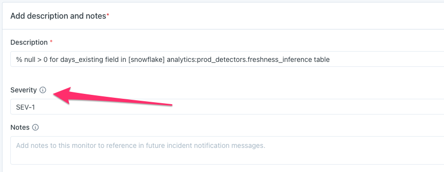
Previously, this was only supported for different kinds of custom rules, but is now available for any custom monitor type. If the severity is set on a custom monitor, then all incidents generated by that monitor will inherit that severity.
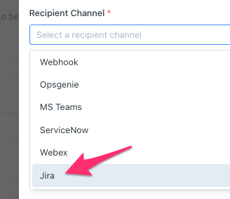
Users can now send Monte Carlo notifications directly to Jira to create Jira Issues. Previously, a user could only create a Jira Issue by clicking a button from IncidentIQ. However, for Incidents from certain critical tables or critical monitors, some customers wanted to send those Incidents straight to Jira without having a human-in-the-loop. With this recent improvement, it’s now easy for them to do that.
Note: this improvement is only available in Notifications 2.0. Learn more in our docs.
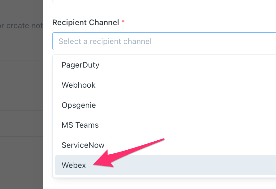
Monte Carlo now integrates with Webex, which offers a collaboration tool similar to Slack and Microsoft Teams. This integration allows sending of notifications directly to channels within Webex, to keep data teams and stakeholders up to date on any recent data issues.
Check out the docs to learn how to set this integration up.