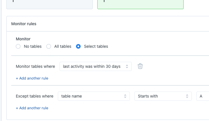
A "last modified by" field has been added for custom monitors in the monitors details page. A "last modified at" time field is also available for SQL rules monitors. In addition, the "created by" field, which used to update when monitors are modified, is now fixed and will not update anymore.
BI tools tend to have a lot of content named similarly - with this release we added some information about the hierarchy of each asset in asset search results and the top of the Asset page. We also added an icon for the specific type of asset as well as a column in the search result to make it easier to find what you are looking for.
- 
Looker
- Dashboard: Folder
 - Dashboard Tile: Parent Dashboard name
 - Explore: Model
 - Look & View: Not yet available
 
 - 
Power BI
- Dashboard: Workspace name
 - Report: Workspace name
 
 - 
Tableau
- Workbooks: Site name + Project name
 - View: Workbook name
 - Live Data Source: Container name
 
 
We're steadily refreshing all the notification formats in MS Teams to align with what's worked well in our Slack integration. Most recently, we've updated the formats for all rule notifications (SQL Rules, Freshness Rules, Volume Rules, and Field Quality Rules). These deliver information in a more digestible and intuitive format.
With the release of the Asset page side-nav a couple months ago, users can now access Asset pages for projects and datasets. These pages were pretty sparse.
Weâve reformatted them to look cleaner, and added a tabular view to browse the tables within. This shows the tables' Importance Score, reads/write per day, and count of distinct users, helping users understand which tables are heavily used, and which aren't.
Following up on the release several days ago for visualizing Automatic Thresholds in SQL Rules...
The charts for SQL Rules with Relative and Absolute Thresholds now show an overlay of thresholds over time, with granular detail available in the tooltip. This allows for a much better understanding of what thresholds the results of the SQL are being compared against, building better trust between users and the system.
In the performance dashboard, if users click into any query details drawer for a write query, two additional charts are added alongside the run time chart and volume chart: i) partitions scanned v.s. total partition chart, ii) % scanned from cache. These are available for Snowflake accounts.
In the performance dashboard, if users click on a query and open the drawer, they can see any Github Pull Requests overlaid on top of the volume chart. Hovering over the PR lines will also display the PR details including title, author, merge time, and link to the PR in Github.
On the main dashboard, Bigquery customers can now toggle to 2 additional metrics: Bytes Billed, Slots Used. When clicking into the details drawer of a write query, users can also see the corresponding charts for those metrics.
SQL rules users are now able to get automated suggestions for investigation queries based on how their team researched breaches of that rule in the past.
You can now push a Data Quality Warning into Tableau from Monte Carlo, on the "Reports Affected" page of an asset or an incident.
Set a message, and you can edit it afterwards. The Data Quality Warning will expire approximately 24 hours after it's set or edited.
More info in the docs here: https://docs.getmontecarlo.com/docs/tableau and about Tableau Data Quality Warnings here: https://help.tableau.com/current/online/en-us/dm\_dqw.htm