Intro to opt-in monitoring
In addition to Monte Carlo's automated monitoring, you have the ability to enable customizable monitors on tables and views in your data warehouse.
There are two different areas of these customizable monitors. This guide details opt-in monitors. Click on the links below to learn about each opt-in monitor.
Visit our FAQ for opt-in monitors
Opt-in monitor types
Opt-in monitors are ML-based monitors that query tables and views to provide broad field-level observability for your most important data assets.
- Field Metric (automated detection)
- Dimension Tracking
- JSON Schema
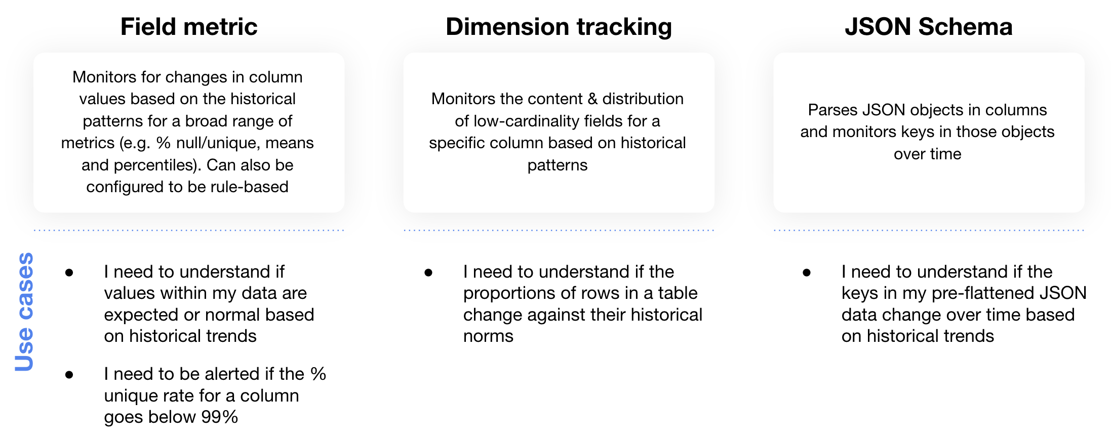
Summary of Monte Carlo's opt-in monitors
Field Metric Monitor
Field metric monitors (with automated detection) can be enabled on a table or view to alert you when there are deviations in field-level values against their normal historical patterns.
The way this monitor works is by calculating statistics on columns in your table or view and using historical patterns from these statistics to build thresholds of normal behavior.
Examples of the statistics we calculate are the percentage of a column that has null values (% null), the percentage of a column that has unique values (% unique), and the average value of a column if it is a numeric data type (mean). You can see a list of all of the statistics we calculate here.
Based on the historical statistics collected at the field level for these columns, Monte Carlo builds upper and lower bounds. You can view these by going into the field health monitor's detail page and scrolling over the graph:
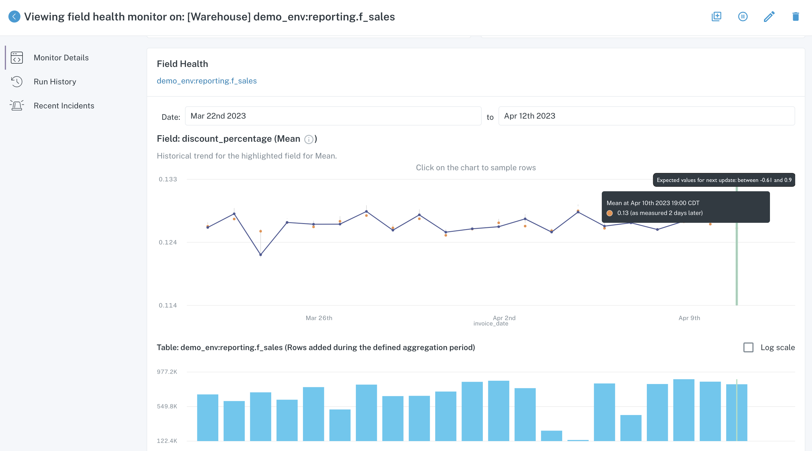
Field health monitor detail page
If the next measured value for that column and statistic goes outside of the thresholds, the monitor will create an incident. In this case, the upper and lower bound for the average of the column discount_percentage is between -60% and 90%. If data causes the average to fall outside of those bounds, for instance if the average was a 95% discount, Monte Carlo will alert you to this anomalous behavior.
In the example below, you can see a field metric anomaly triggered by this monitor:
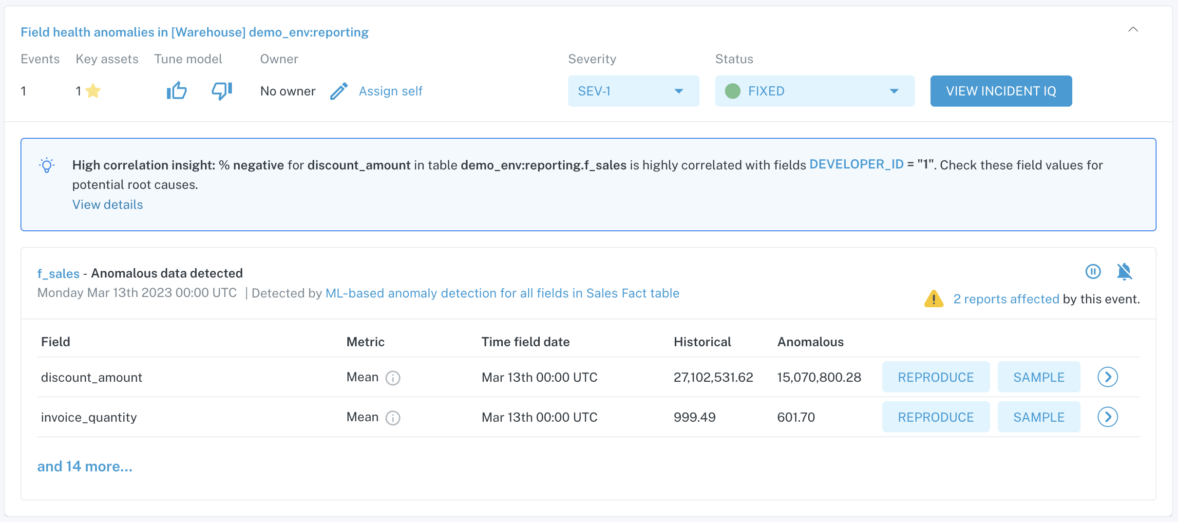
Incident summary for a Field Metric Monitor anomaly
In this case, many columns were observed to have their respective metrics fall outside of normal historical patterns. Having observed this with Monte Carlo, we can now dig into why these field values changed and determine whether it is expected or due to data quality issues.
Learn more about field metric monitor specifications here
Dimension Tracking Monitor
Dimension tracking monitors also look at field-level data, but rather than creating and alerting on anomalous statistics like in the case of field health monitors, this monitor looks at the distribution of unique values (or dimensions) within the column.
The way this monitor works is by grabbing all distinct values in a column with their respective row count and then building thresholding for the historical distribution of values.
For example, let's say you had a table called users that had one row per distinct user and this table had a column called original_referral_source that contained the source (e.g. google, linkedin, organic) that designated how each user originally landed on your marketing website.
The dimension tracking monitor would take all distinct values in the original_referral_source column and track what percentage each source accounted for over time, i.e. google accounts for 30% of rows, linkedin accounts for 10%, organic accounts for 15%, etc. After we have built historical thresholds for the distribution of these distinct values, we would alert you if the distribution of one or more of the values falls outside of the thresholds, or if distinct values change over time, i.e. new distinct values are introduced or disappear.
In the example below, you can see the distributions that are tracked with a dimension tracking monitor on a column called status:
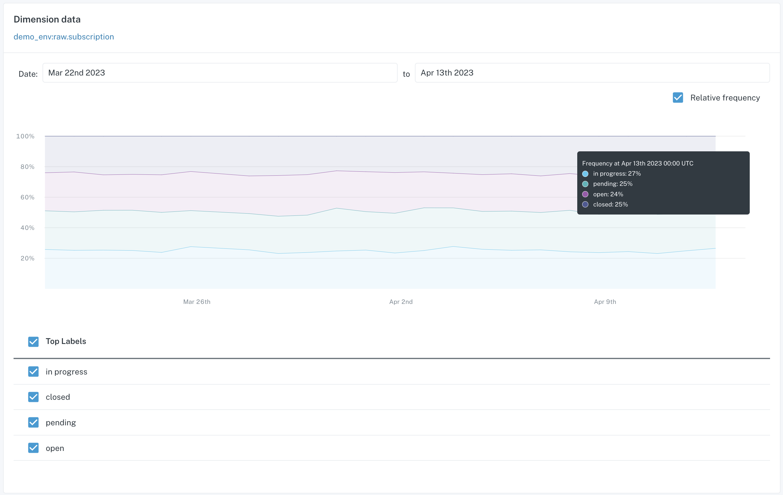
Detail page for a Dimension Tracking Monitor
In this case, there are 4 distinct values tracked. An anomaly for this monitor arose when new value pending was added to the column:
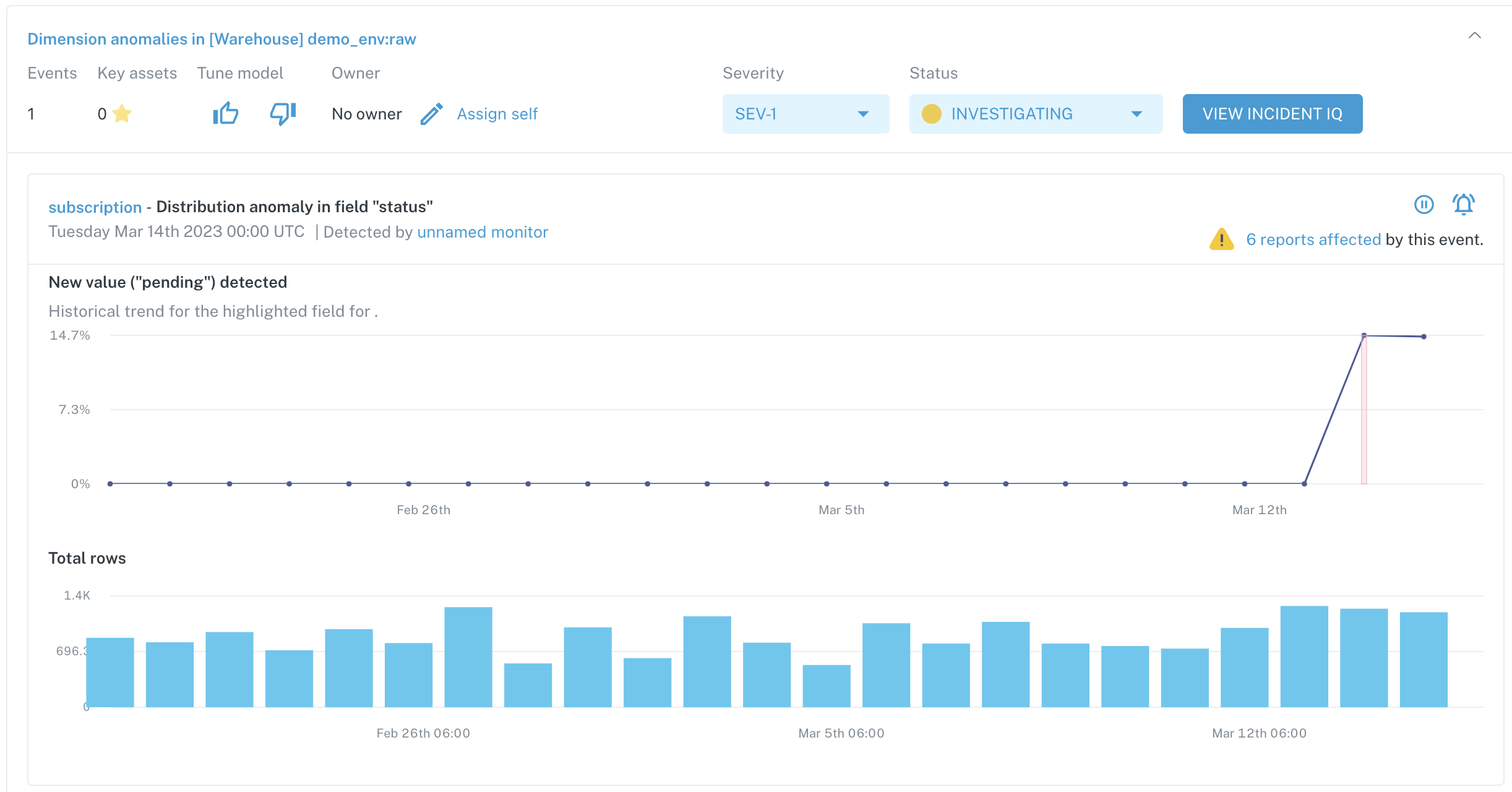
Incident summary for a Dimension Tracking Monitor anomaly
We can now use this field-level observability from Monte Carlo to see if a new value was an expected change or if there is a data quality issue upstream.
JSON Schema Monitor
Our JSON schema monitor works similarly to our automated schema monitoring except that it looks at the keys in a column housing JSON objects rather than monitoring the columns in a table or view.
If you have a table or view that stores unflattened data in a JSON data type, you can utilize the JSON schema monitor to look at distinct keys in the JSON object and alert you to changes like keys being added or removed.
For instance, if a column in your table typically included:
{
  "item1": "abc",
  "item2": "def",
  "item3": "ghi"
}
The JSON schema monitor would track additions and deletions to key/value pairs. So you would get alerted if the following change occurred:
{
  "item1": "abc",
  "item2": "def",
  "item3": "ghi",
  "item4": "jkl",
  "item5": "mno"
}
Now that item4 and item5 are showing up for the first time, the JSON schema monitor will recognize this and create an incident.
Note that the JSON schema monitor requires a true JSON object, not one wrapped in a string or array. The keys in the JSON object can be at any level of nesting with this monitor, so we will also be able to detect keys within objects.
Below is an example of an incident generated from a JSON schema monitor:
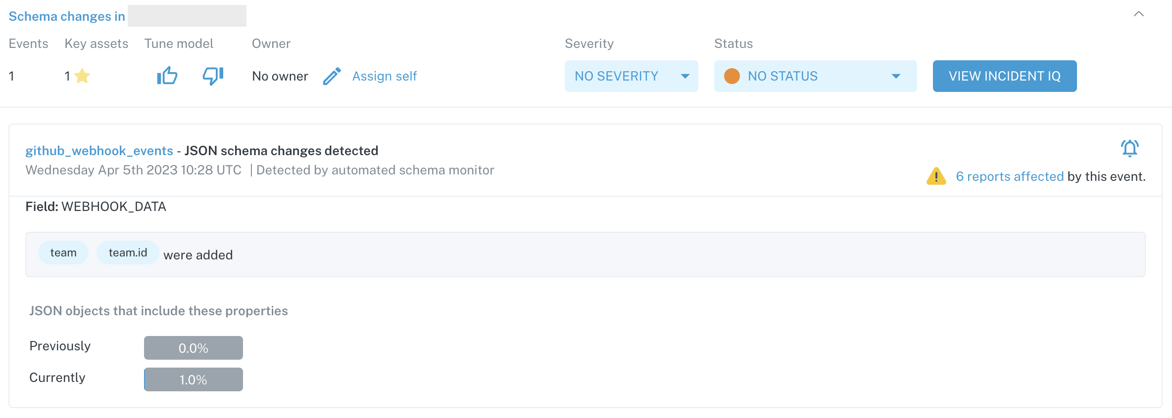
Incident summary for a JSON schema anomaly
In this case, two new keys were added to the JSON object, team and team.id. We also list the percentage of rows that include these new keys.
Frequently Asked Questions
Can I create an opt-in monitor for multiple tables?
You can currently only apply an opt-in monitor to one table per monitor. If you'd like the same monitor on multiple tables, you will need to set up a monitor for each table.
In the case of dimension tracking and JSON schema monitors, you will set up one monitor per column.
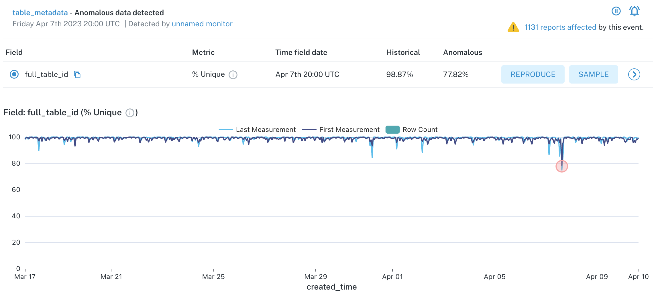
What do the different color lines mean in the graph displayed by a Field Health monitor?
In the Field Health monitor graphs, you may see a dark blue line and a light blue line displayed. The dark blue line represents the value of the first measurement of the aggregation bucket, and the light blue line represents the last measurement. Variations can occur between measurements if the data changes between executions of the monitor, and Monte Carlo always uses the value of the first measurement to trigger incidents.
Field Health Metrics Graph
My data doesn't update very frequently, what are my options? If I set up a monitor to run weekly, will it work?
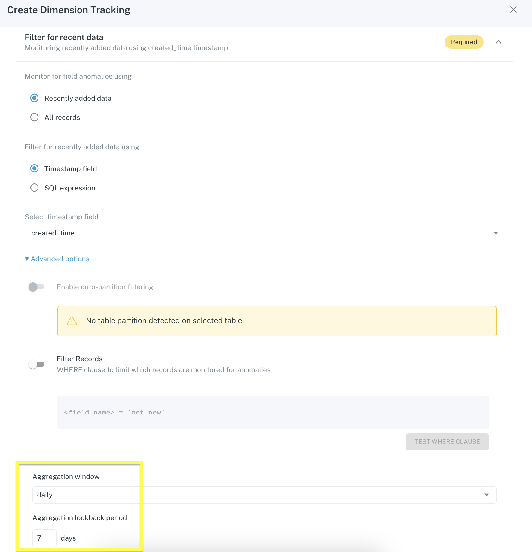
For tables that receive fewer updates, it is possible to configure a Field Health or Dimension tracking monitor to run on a weekly basis. You must set the Aggregation window to daily and the lookback period to 7 days.
What is the best timestamp to use in monitor configuration?
When you choose Recently added data in your monitor configuration, you will need to specify a timestamp column in the table to bucket data into. We recommend using a timestamp that is most reflective of the last time a row was updated.
Updated 18 days ago