Table health
Overview
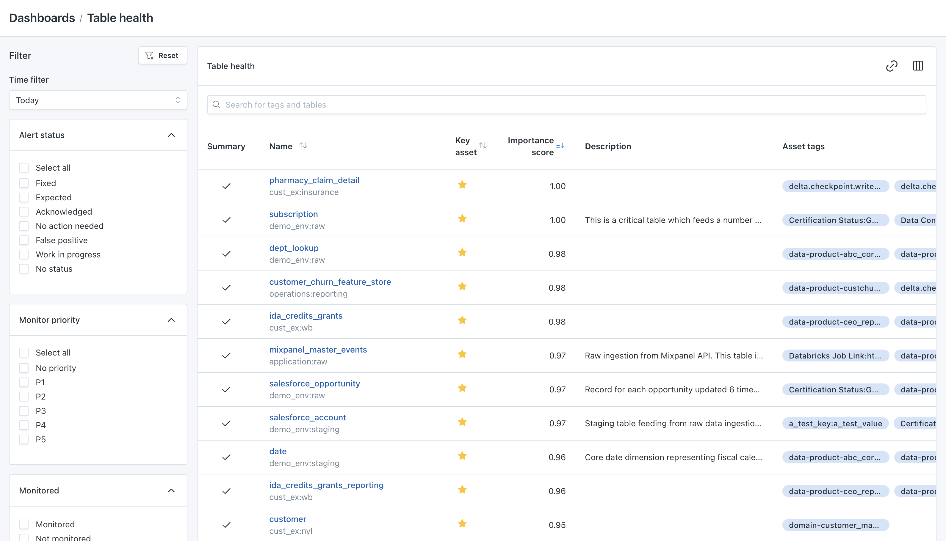
The Table Health Dashboard allows users to get an “at a glance” overview of data quality across all of the objects within a data lake or data warehouse. This dashboard is designed to identify incidents that are raised against the tables within a data lake/warehouse (an incident is a data anomaly caught by Monte Carlo). Think of the Table Health Dashboard as your incident resolution inbox or incident resolution to-do list.
Click here to view your Table Health Dashboard

Table health dashboard
Dashboard filters
Search
The Search filter allows a user to sort or filter by the given table name or tag. It can also sort by partial name (i.e. “contains Snowflake”) and can deliver full or quasi-search results.
Time filter
Lookback Range is the date parameter filter of the detected incidents. It consists of a multi-select drop down menu that includes Today, Yesterday and Today, 7 Days, 2 Weeks, 3 Weeks, and 4 Weeks. We typically recommend using a 2-week lookback window as best practice.
Alert status
The Incident Status filter allows a visualization of incidents that include Fixed, Expected, Investigating, No Action Needed, False Positive, and No Status. The selection of any of the above filters will refine the Table Health Dashboard to include only the tables with the incident statuses that have been selected.
Fixed: Incident has been flagged and resolvedExpected: Change has been made with anticipation of incidentInvestigating: Incident has been flagged and is under investigationNo Action Needed: Incident has been flagged and required no actionFalse Positive:: Incident was incorrectly identified as anomalous behaviorNo Status: Incident has not been flagged and needs update
Monitor priority
The monitor priority filter allows users to filter by the priority applied to a monitor. Alerts generated from a monitor inherit that priority. Priority can only be updated on a monitor. This filter displays a checkbox style menu that consists of 6 different severity options (No priority, P1, P2, P3, P4 and P5).
Dashboard views
The Table Health Dashboard is viewed below the filters and can sorted by the following categories in ascending or descending order:
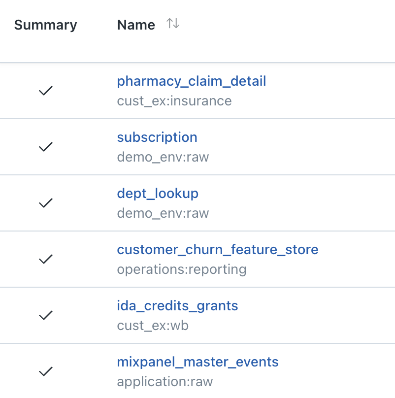
Name: Includes the names of the data tables available by selected filtersKey Asset: A Key Asset is a table with an importance score at or above 0.6. (We calculate importance score by the number of reads, the number of users, the degree connectivity, the update periodicity, and the age & freshness)Importance Score: The Importance Score (as noted above) is a table score prescribed by the number of reads, the number of users, the degree connectivity, the update periodicity, and the age & freshness. Every table is prescribed an importance score ranging from 0.01 to 1
On the far left hand side of the table you will find Summary. The summary column is used to outline the total number of incidents and statuses in a designated table. Under the Summary column you will find a circle with a specified color and the total number of incidents (or a check mark which indicates an active monitor with no incidents). The circles will be shown in one of three colors (Green, Yellow, and Orange). Each color indicates the tables status ranging from green (no incidents, fixed, expected, no action needed, false positive), yellow (investigating), and orange, the most severe, (no status). A green check mark indicates that a monitor is active or an incident has been resolved. A green circle with a number inside indicates the number of incidents that have been resolved by one of the following categories (no incidents fixed, expected, no action needed, false positive). Keep in mind the the circle color will be indicated by the most severe incident on the table (ex. if there are 10 total incidents, 3 of which have been resolved, 6 that are in investigating status, and 1 that is in no status, the circle will remain orange as it is pulling the most severe status which in this example is no status).

Summary and Name columns
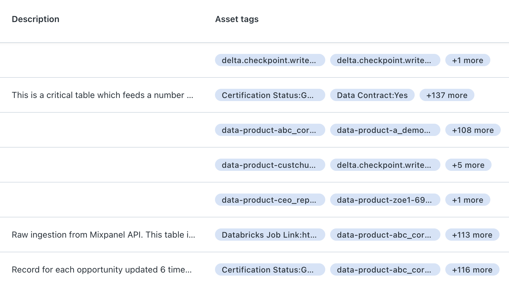
In the center of the table you will find the Description and Asset tags column.
- The
Descriptioncolumn is typically the imported description from a Data Warehouse. It can also be manually added. - The
Asset tagcolumn is also typically imported from a Data Warehouse and can be manually added.

Description and asset tags columns
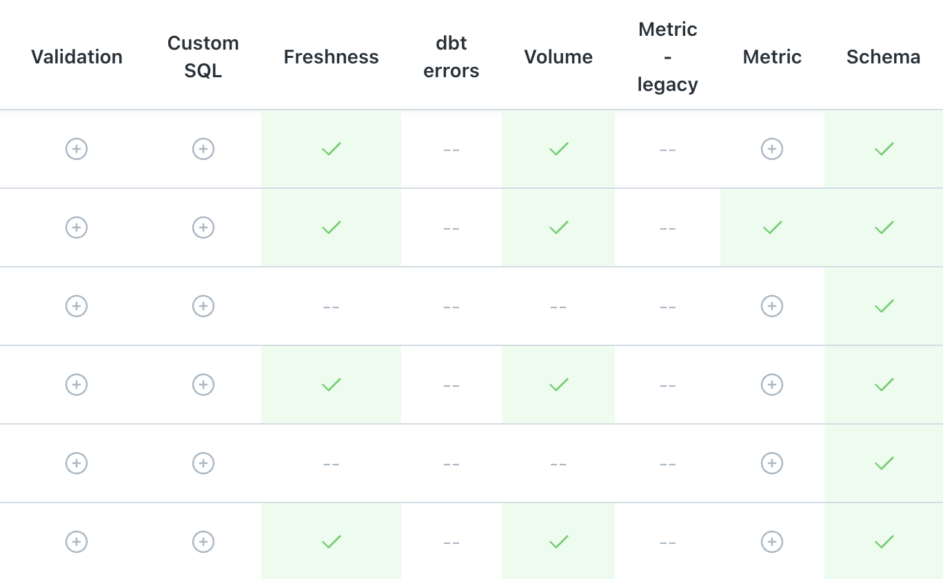
To the right of the Table Health Dashboard you will find the columns SQL rule, Freshness, Volume, Field Quality, Field Health, Dimension, and Schema. These represent the different monitor types that Monte Carlo allows in a table. Below each of those columns you will find a + symbol, a green circle, an orange circle, or a yellow circle. The number of incidents that relate to each anomaly will be identified in the circle. Similar to the Summary section above, a green circle indicates the incident status has either been "fixed", "expected", "no action needed", or a "false positive". A yellow circle indicates an "investigating" status, and an orange circle represents the most sever status "no status." A green circle with a checkmark indicates that a monitor is active and no incidents have occurred.

Status columns
You can copy your filtered view URL using the copy icon. Additionally, you can also show/hide columns on the table using the column chooser.

Column chooser
Updated 7 months ago
