Dimension Tracking
This tutorial will go over the basics of Dimension Tracking monitors to help better understand its applications for data quality monitoring.
Last Updated: August 1, 2022
Transcript
Welcome back to Monte Carlo University! Today, I will be walking you through our dimension tracking monitors. Dimension tracking monitors extend our machine learning to apply distribution analysis to the field value for a given field. This is best suited for low-cardinality string fields with a total number of possible values ranging up to around 200 values.
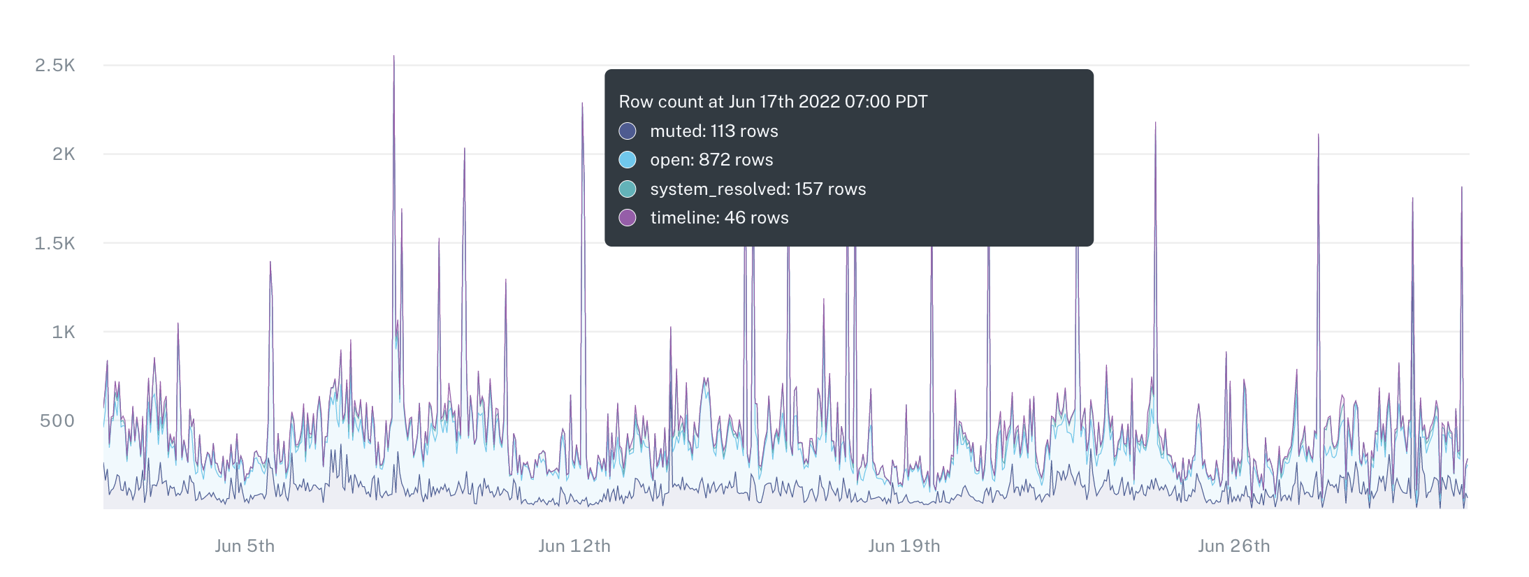
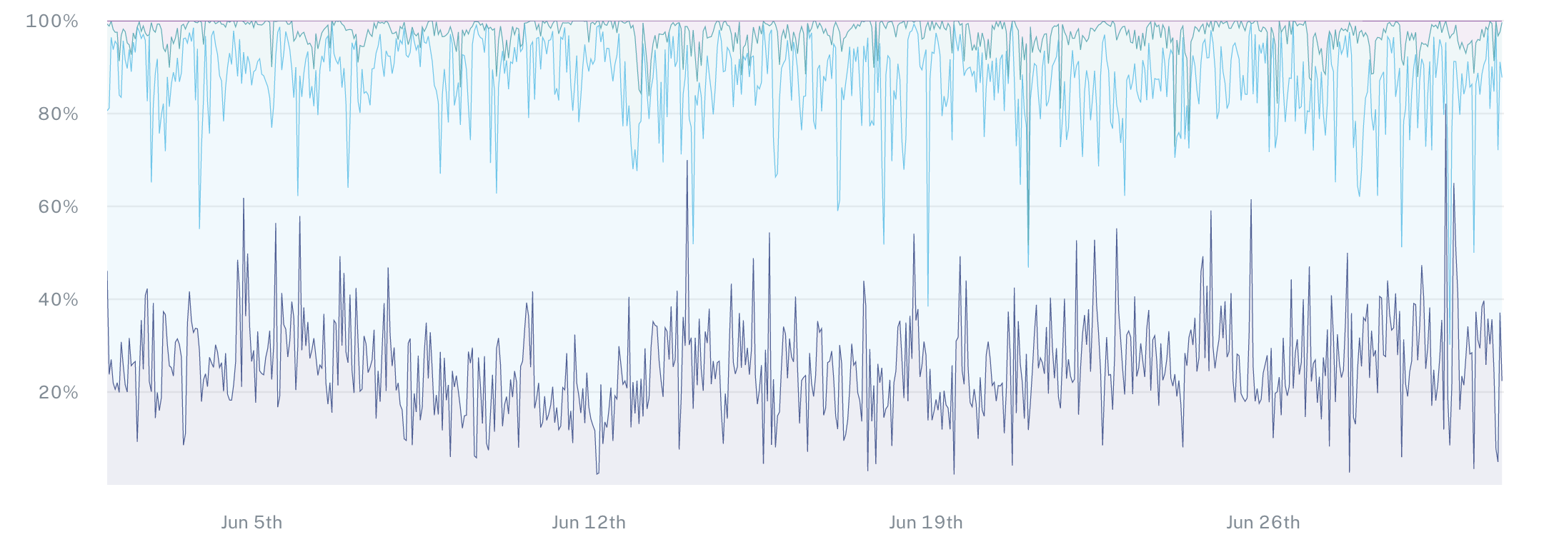
In this specific example, I'll be looking at the dimension tracking monitor for the field event_state. Within the field event_state, there's a possible value timeline. In this case you, you can see the distribution over time. As you can see towards the end of this graph, there's a large spike in the distribution by percentage of overall values in this table.

If I jump into the specific model here, we'll be able to see a little bit more information. As I scroll down, we can see the total number of different, unique, possible values for this field. As we can see here, open, muted, system resolved, and timeline on the graph above. I can see over time the total number of rows that account for each possible value.

I can also convert this and view this in relative frequency so that I can see the distribution as a percentage based on the historical values over time and the relative frequency. We then create thresholds and alert you in the case that this frequency changes. If new values appear, or if values that historically appeared and start showing up as 0% of the overall distribution.
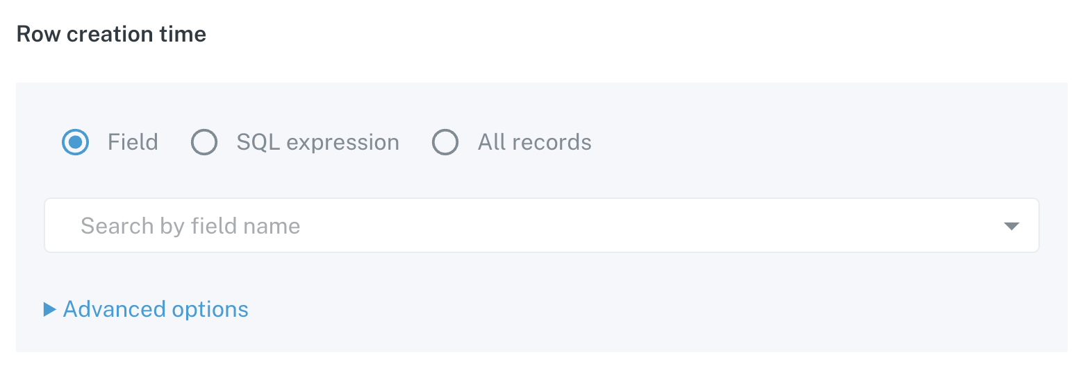
Now, if I jump to the creation process for a dimension tracking monitor, the first option we have here is first to choose the table I want to set this up on. Next, we then choose the field specifically that I want to start to analyze. As I come in here, I can go through and choose a specific field. As I click to continue very similarly to our field health monitors, we have the option to choose the timestamp field within this table that we will then use to graph the distribution over time of these values.

In this case, we have two options. We alternatively can use a sequel expression if there is a field within this table that can be converted to a timestamp ,or alternatively all records in the case that every time you check, you want to check the entire table for the distribution and see that change over time.
Under the advanced options, we have the option to change the aggregation window between hourly and daily, which buckets the time or buckets the data based on the timestamp you choose into either their hourly or daily buckets.

Lastly, with the monitor schedule, you have the option to set the default, which will then check your table every 12 hours for new data, or alternatively set your own custom time schedule. If you choose dynamic, we will leverage our freshness monitoring that is out of the box to see when the table is updated and automatically trigger to pull the new data when the table is updated.
I hope this was helpful and please feel free to reach out to [email protected] or the chat bot in the lower right hand corner if you have any more questions!
Updated 10 months ago
